Synelindesthesia

Synesthesia color wheel 2019
Since doing the show "Synesthesia" at Flow in 2014, I've tuned in more closely to my own grapheme-color synesthesia, and earlier this year, I made this color wheel which orders the way I see the letters of the alphabet. I don't actually "see" letters in color literally but rather in my mind's eye, where I’ve always conceived of each letter as a certain color. There's much research of late into all of the forms of synesthesia, of which grapheme-color is one of the the most common (see the Wikipedia on it for more info), but until I did the Synesthesia show I didn't think too much of it. I just thought everyone had their own version of letter/number color associations or spatial ways of seeing numbers and time (like decades) spread out in their mind (I also have these versions - spatial sequence and number form), especially since my husband has mild grapheme-color synesthesia with numbers, and some of the numbers match mine - 5 is orange for example. Anyway, when I finally made this synesthesia wheel, I suddenly realized that my consonants were pure colors and only my vowels (and my “L”, which I attribute to its visual similarity to a capital “I”) were either black, grey or white.
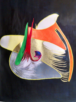
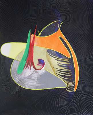
So I started thinking about using words as a point of departure for drawings. I noted the colors associated with my own name S (gold), E (black), L (white and black), I (black), N (orange), D (green), E (black) and started working with them in the drawing below which became How My Heart Spells its Human Name:
And when I say gold, I mean metallic, glinty, flakes off the page gold, as in medieval illuminations:
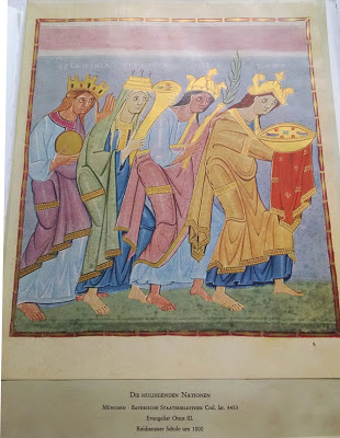
"Die Huldigenden Nationen" from the Gospels of Otto III
As I drew, I realized, I was making another picture of my heart , this time as an alchemical vessel, circulating and weaving energy like venous and arterial blood, and emanating it back out into space.
As the summer wore on, I tried formatting a drawing using the colors of the letters of the word “sovereign” from left to right, with the “s” represented with gold patterning, “o” in white, “v” in green, etc. to the “n” in orange. (I’m not sure what the pink and red and black is on the far right - I seem to frequently have layers pulled back exposing something in my drawings so maybe more blood vessels?)

“Sovereign”. Oil pastel, charcoal. 2019.
Meanwhile I was weaving with no color at all.

“Aorta”. Stainless steel, silk, wool. 2019.
As I look back over my work since the coverlet wall hangings ten years ago, I see them now as mostly about color, not structure. Sure, they were complex weavings, but my true interest was in how the colors interacted, not to mention that I put so much effort into producing those colors with natural dyes. I think I was producing paintings in the only way I felt trained to do so. When I made my first drawings in 2015, I felt a liberation with how I could express myself using color, but I wasn’t able to quite leave off weaving completely, so I made colorless, even often transparent, fiber skins. I had isolated color from fiber. I don’t know why it happened this way. But now I find the two paths diverging so much that I feel compelled to choose one direction only, and I find myself choosing color. We shall see if it converges with fiber again over time. I’m no Anni Albers, but she ended up making prints later in her life, finding, according a recent Guggenheim Bilbao show, “a new space for visual investigation that would eventually replace her textile work completely.” I remember learning this about her in grad school and being mystified as to how such a thing could ever happen. Now I’m beginning to get it.